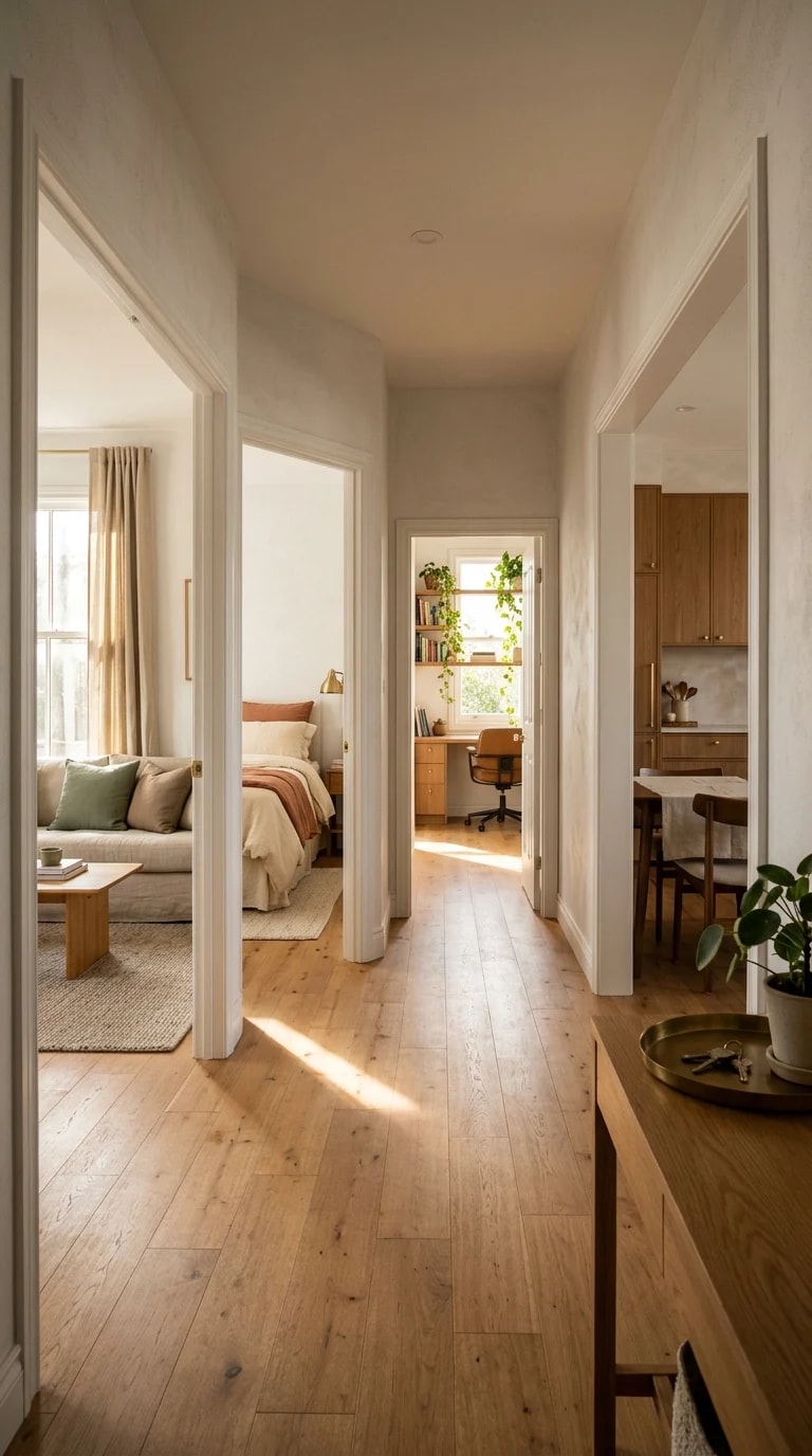
Few spaces in a home work as hard as the hallway, and few are asked to do so little visually. In this house, the corridor is not a passage to be hurried through but the compositional spine of the entire plan. A slim wooden console anchors the foreground, its potted plant breaking the vertical line just enough to feel lived-in, while the floor stretches ahead in warm hardwood. Doorframes line up like tick marks. Beyond them, rooms appear as framed vignettes: a bedroom washed in rust linens, a living room holding a white sofa with sage-green pillows, a bright office crowded with desks and plants, a kitchen of pale wood. The effect is architectural and editorial at once, a one-point perspective that turns daily circulation into a slow reveal.
That reveal is the essence of what makes the Zara Home graphic design sensibility so persuasive in real spaces. It is not about pattern for its own sake; it is about contrast, alignment, and the confidence to let a few strong elements carry the frame. Here, sunlight does the heavy lifting. Sharp geometric shadows travel across the floorboards and up the walls, turning the corridor into a moving composition that changes by the hour. Crisp white doorframes act like drawn lines, separating one field of color from the next. The palette stays deliberately narrow—cream, honeyed wood, rust, sage—so that each room reads as a distinct panel in a single, cohesive series.
The practical lesson is restraint. A hallway this narrow cannot absorb clutter, and it should not try. Keep the floor clear, choose a console with open legs so light passes beneath it, and let one object—a plant, a bowl, a single framed print—do the styling. Treat the doorframes as part of the design rather than trim to be ignored; painting them the same white as the walls sharpens the geometry. Repeat a tone from room to room, even quietly, so the eye links the spaces. The sage pillow in the living room and the rust bedding in the bedroom are not matching, but they belong to the same family of muted earth colors, and that kinship is what makes the view down the hall feel intentional.
Light is the material you cannot buy, but you can stage it. Sheer curtains, clean windows, and a conscious decision not to block the corridor's natural path give the sun room to draw its shapes. Morning light will stripe the floor; late afternoon will warm the wood. Resist the urge to fill every wall. The emptiness is the point—it lets the framed rooms breathe and lets the shadows read as pattern rather than noise.
Step into a hallway like this and you feel the house settle. It is calm, ordered, and quietly generous, a spine that holds the rooms together without asking for attention. That is the real luxury of good graphic design at home: not more, but exactly enough.