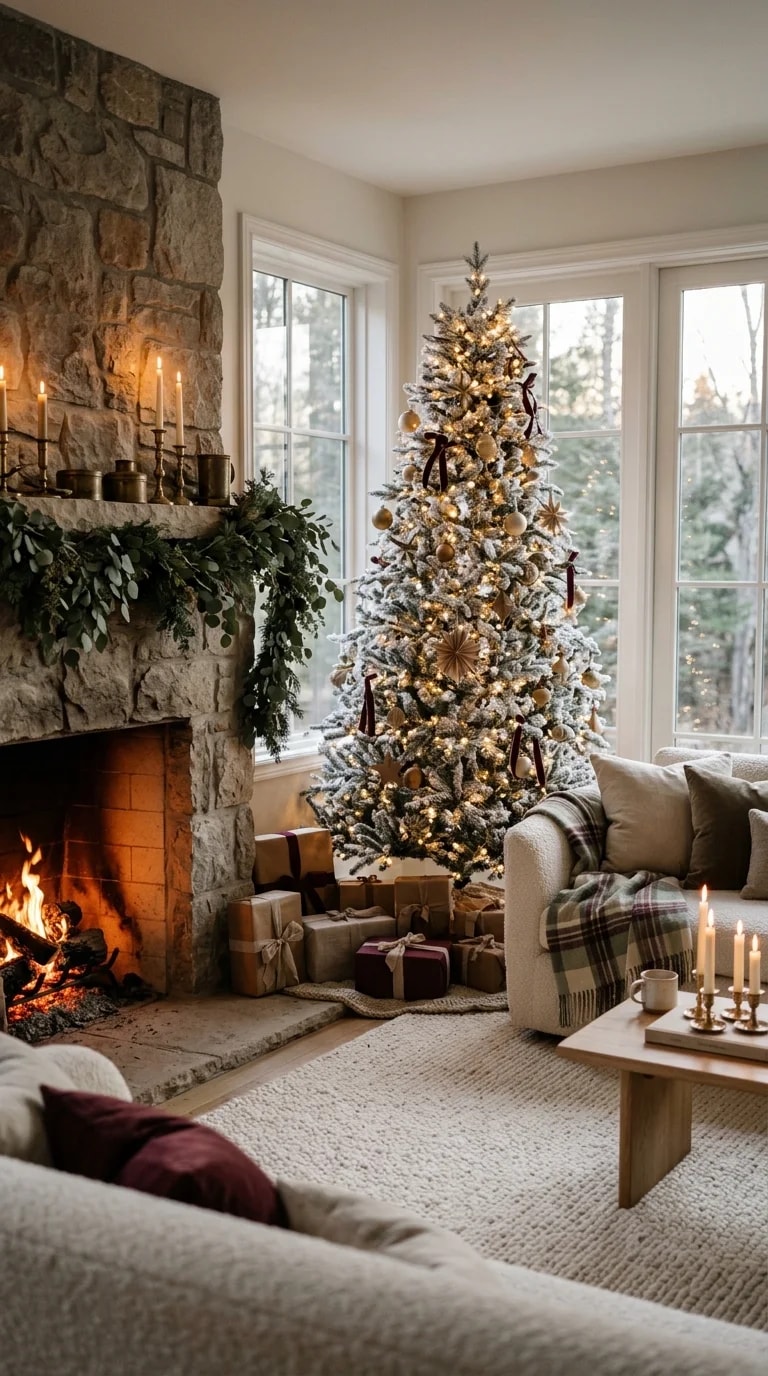
In a room like this one, the paint is doing the quietest possible job, and that is exactly why it works. The stone chimney breast, the densely decorated tree, the burgundy ribbons and the cream sofa are all competing for attention, so the walls need to step back without going cold. The instinct is often to reach for a crisp cool gray or a bright builder white, but both will fight the firelight and make the evergreen look flat. A warm oatmeal or mushroom neutral picks up the stone's subtle undertone instead of contradicting it, and it lets the candles and tree lights feel like the brightest thing in the room.
Start by sampling against the stone, not against a paint chip fan. Stone reads differently depending on the hour: cool and slightly blue in the daylight pouring through tall windows, warm and almost taupe once the fire is lit. Choose a greige with a touch of yellow or red in the mix rather than a green or blue base, and paint two large boards you can move around the room. Look at them at eight in the morning and again at eight at night with the lamps on. The color that holds its warmth in both lights is the one to buy.
For the mantel and trim, a warm white with a hint of cream keeps the edges crisp without looking chalky against rough stone. Satin or pearl finish on the mantel earns its keep, since soot and candle smoke wipe off far more easily than they do from flat paint. Walls in eggshell give you scrubbability without glare, and the ceiling can go one shade lighter than the walls in a matte finish so the tall tree doesn't look like it's been cropped. Resist painting the stone itself; if it has darkened with soot, a proper cleaning and a breathable masonry sealer will do more than a coat of paint ever will.
Warm walls also change how the decor behaves. Burgundy velvet ribbon, oatmeal throws and a plaid blanket all read richer against a soft beige than against gray, and the light wood table suddenly looks intentional rather than washed out. Keep bulbs around 2700K so the tree lights match the fire rather than the daylight, and let the windows stay cool and blue; that contrast is half the atmosphere.
The practical part is simple: two coats over a stain-blocking primer if you're covering a darker color, and a pint saved for touch-ups in January, when the tree comes down and the room has to stand on its own. That is the real test of a holiday palette. If the walls still feel calm and generous once the greenery is gone, you chose the right oatmeal.