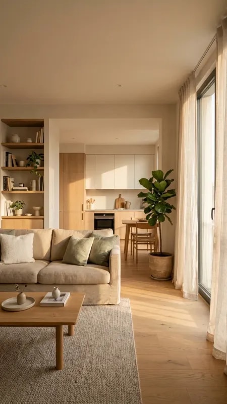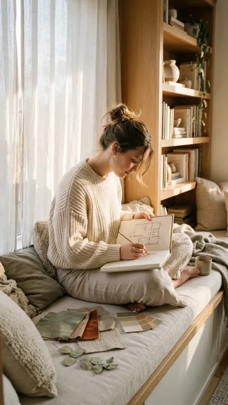
There is a particular kind of wall that never gets photographed on its own, yet it is the one guests remember. It is the wall beside a window, in a room where someone sits with a coffee and a spoon on a round wooden table, and the street outside does the moving. What makes it work is not a statement feature. It is restraint, warmth, and a deliberate refusal to compete with the person sitting in front of it. If your own dining nook or kitchen corner feels flat, the fix is rarely more decoration. It is usually better light, softer color, and fewer objects chosen more carefully.
Start with the architecture you already have. In the photograph, the window mullion acts as a vertical anchor, quietly organizing everything to its left and right. Your wall has the same gift: a window frame, a door casing, a change in ceiling height. Paint the wall immediately around the glass a warm cream or soft white so it reads as an extension of the daylight rather than a border against it. Resist hanging art that overlaps the window opening — it chops the light and makes the corner feel crowded. Let one tall vertical element, whether a frame or a slim shelf, do the work the mullion does here.
Then build a background layer that is intentionally a little blurry. Behind the seated figure in the image, greenery and warm pendant bulbs sit out of focus, offering color and glow without demanding attention. Recreate that by treating the back of the room as scenery: a low-saturation green plant in a simple pot, one or two warm bulbs around 2700K rather than cool white, and wood tones that echo the table. Keep the saturated color count low — creams, browns, muted greens — so the eye reads calm instead of busy.
The surface does more than the wall. A round wooden tabletop, a cup, a saucer, a spoon: that is the entire vignette, and it feels complete. Choose a table small enough that one object per role is enough, then let those objects be good ones. A single ceramic cup left out is styling; five cups are clutter. Add a small vase only if it earns its place beside the light.
Finally, test the wall the way it will actually be used. Sit down with a drink, mid-morning, and look at what surrounds you. If the wall is quieter than the view and warmer than the daylight, you have it right. The goal is a backdrop that holds a life rather than a scheme — the sort of corner you return to without thinking about why.