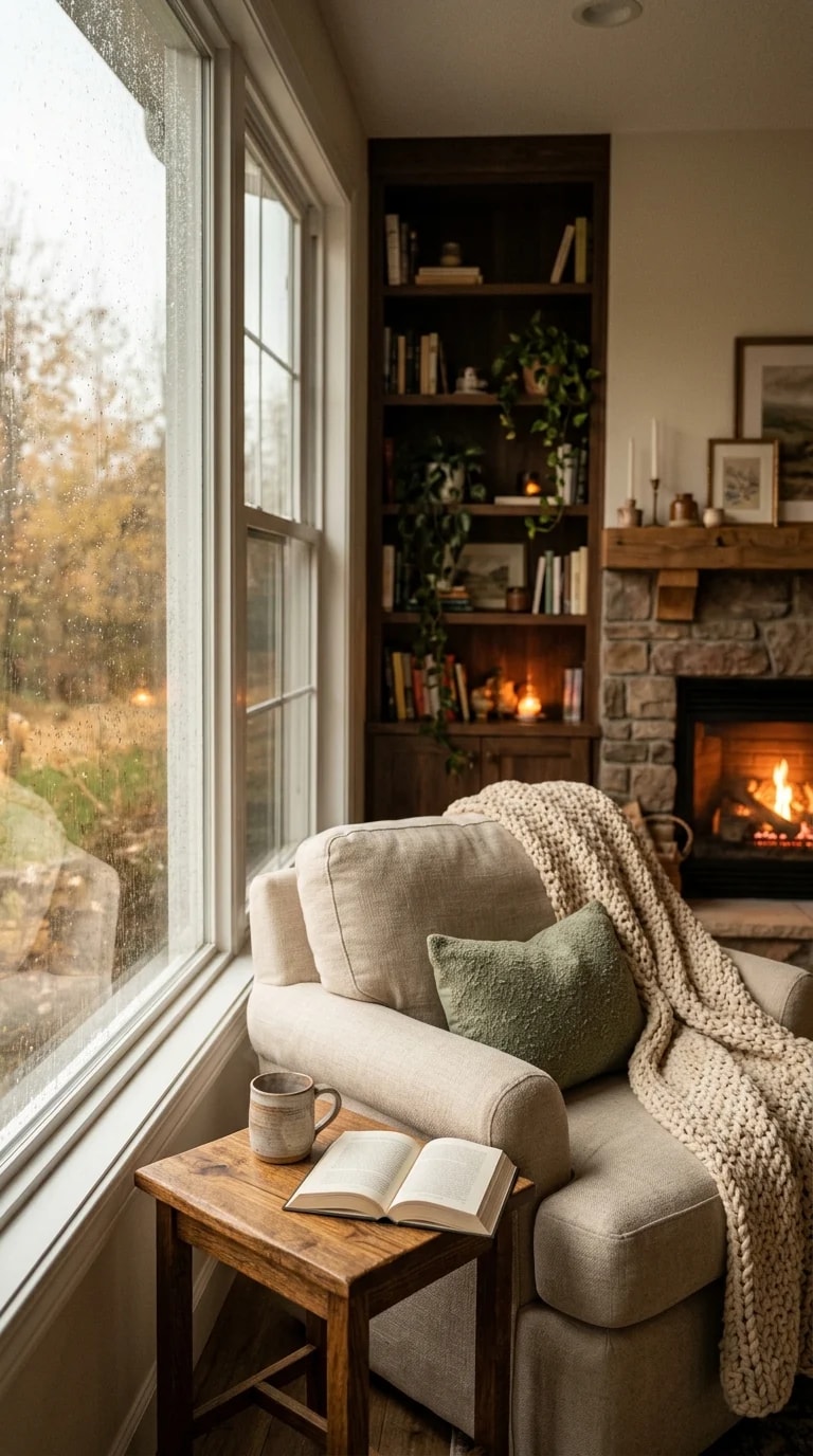
Some color schemes announce themselves from the doorway. This one whispers. The palette in this reading nook is built almost entirely from softened earth tones — oatmeal upholstery, cream knit, stone gray walls, walnut shelving — with one muted sage cushion and a spill of amber light doing the talking. It is a useful lesson in restraint: three or four close-in values can create more depth than a dozen competing hues, because the eye is free to notice texture instead of color noise. The chunky throw, the rain on the glass, the fringed cushion edge all read clearly against a quiet background.
The anchor is the armchair, a warm oatmeal that sits just a shade lighter than the walnut shelf behind it. That small step in value keeps the chair from disappearing into the wood while still letting them feel related — a trick worth stealing whenever you pair pale upholstery with dark built-ins. The sage cushion works because it is desaturated: a brighter green would have turned the corner into a springtime cliché, but this grayed-down version reads as foliage, echoing the trailing plants on the shelves. Stone gray on the walls holds the coolest note in the room, which is exactly what keeps all that cream from going yellow.
Brown is the connective tissue here, and it appears in three separate temperatures. The walnut of the side table is deep and reddish; the shelf carcass is darker still; the floorboards lean golden. Rather than matching them, the room lets each wood keep its own cast, and the shared family resemblance does the work. If you are building a similar palette, pick one dominant wood for the large surfaces and let smaller pieces drift — a warm oak table beside cool-toned shelving is far more forgiving than it sounds, provided the neutrals around them stay soft rather than stark white.
Then there is the amber. Candle flames, a low fire behind a stone hearth, the glow bleeding through a ceramic mug — these warm accents are the only saturated color in the scene, and they punch well above their size. It is a reminder that in a muted room, light itself becomes a material. A palette of oatmeal, sage, walnut and stone gray can feel flat on a gray afternoon; a handful of warm points at eye level and near the floor restores the whole composition. Layer them at different heights so the glow moves through the room rather than pooling in one spot.
What makes the combination work is that it never fights the weather. Rain on the window is treated as part of the design rather than an obstacle to it, and the autumn tones outside rhyme with the woods and warm light inside. Copy the formula and you get a corner that feels finished without feeling styled: soft neutrals to hold the light, one herbal accent to keep it alive, and brown at three temperatures to keep it grounded.