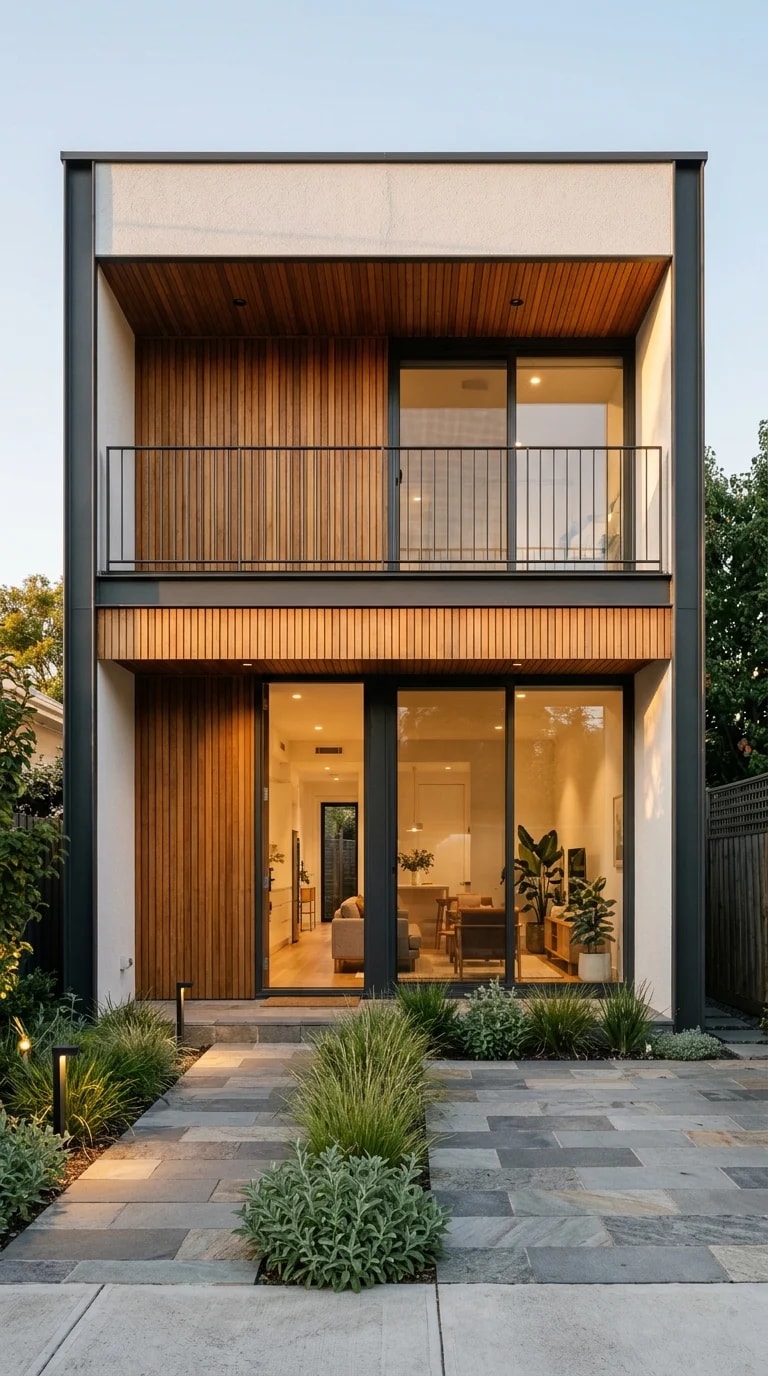
Stand far enough back from this house and it stops reading as a building and starts reading as a layout. The charcoal metal frame divides the cream stucco into clean rectangles, the honeyed wood slats stack in even vertical rhythm, and the glass doors sit flush inside that grid rather than interrupting it. Nothing is centered for the sake of symmetry; everything is aligned so the eye can travel from the stone walkway, up past the path lights and grasses, through the glazing, and into the warm living room without a single jolt. That is the same discipline a well-built interface asks for: a visible structure, a clear path, and no element fighting the one next to it.
The palette is the second lesson. Cream, charcoal, grey stone, muted green, and a honey wood tone are five values of roughly the same quiet volume, and the house works because none of them shouts. Interiors often fail when a sixth, louder color is added to a scheme like this; websites fail the same way. If you are building a home design site, borrow the restraint. Let the photography carry the saturation and keep the surrounding chrome in the cream-and-charcoal range, with one warm accent — the amber of those interior pendants — reserved for the action you actually want taken. A single warm glow against cool dusk does more than a page of competing buttons.
Then there is the indoor-outdoor framing. The sliding doors are wide and mostly transparent, so the living room with its sofa, plants, and pendant lighting becomes part of the exterior composition. From the street, you read two layers at once: the solid, private shell and the lit, sociable interior behind it. Good web design mimics this by revealing depth without clutter — a hero image that shows the room, a caption or card that sits slightly forward, a detail layer that appears on hover rather than all at once. The house never dumps its whole floor plan on the sidewalk. It shows enough to invite, and holds the rest for the people who step closer.
Dusk is doing quiet work here too. The sky is still blue, the interior is already amber, and the small path lights mark the threshold in between. That transition zone is where most of the emotional weight sits, and it is easy to skip. On a site, the equivalent is the moment between landing and clicking — the short copy, the subtle shadow, the small light along the way. Build that middle ground deliberately and the whole thing feels calm, polished, and easy to enter, which is exactly what the photograph makes you want to do.