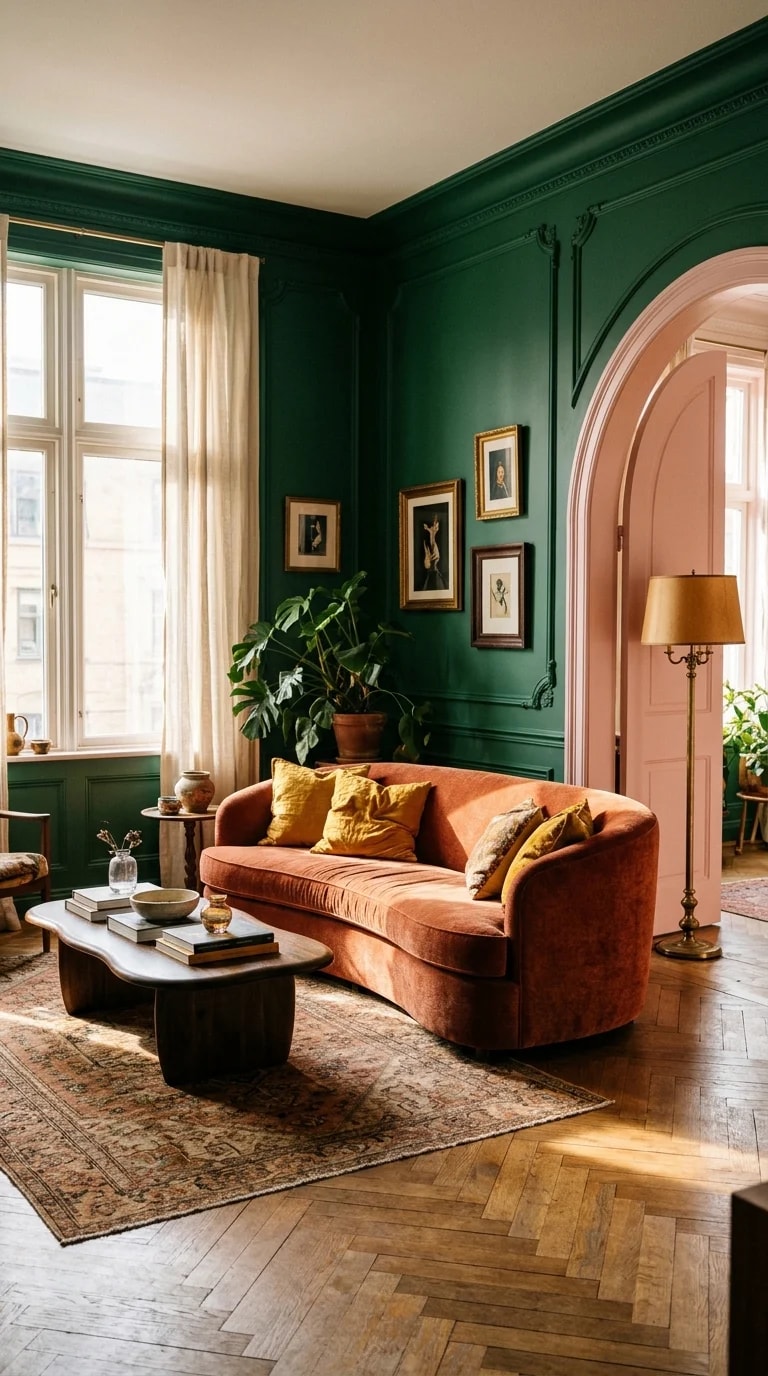
There is a particular kind of confidence in a room that paints its walls deep emerald and then sets a rust-terracotta velvet sofa right in the middle of them. Nothing in this living room apologizes. The curved sofa softens the hard geometry of the corner, its low organic silhouette echoed by a rounded coffee table stacked with books. Herringbone wood flooring warms the floor, a vintage patterned rug adds just enough visual noise, and a tall brass floor lamp throws a small pool of gold against all that green. Through the arched pink doorway, another sunlit room glows like a promise. Day comes in from the left, filtered through sheer curtains, so the shadows stay soft instead of theatrical.
What makes the scheme work is restraint disguised as daring. The walls are saturated, but almost everything else is either warm neutral, wood, or brass, which keeps the emerald from turning cold or costume-like. The terracotta sofa is the only true rival color, and it sits opposite green on the warm-cool spectrum, so the two read as a conversation rather than a clash. Small framed artworks, a leafy plant, and a blush-pink arch repeat the palette in smaller doses instead of introducing new ones. That is the quiet rule behind most color-drenched rooms: pick one hero shade, choose a single opposing accent, then let texture do the rest.
If you want to test the idea in your own home, start with a corner rather than a whole room. Paint a section of wall in the deepest tone you are drawn to and live with it for a week, watching how it changes at 8 a.m. and again at dusk. Velvet, wool, and brass all catch light differently, which is why this room feels alive rather than flat. Keep the trim and ceiling in a soft cream so the color has an edge to push against, and repeat your accent hue at least three times at different scales — a cushion, a lamp base, a single ceramic vase — so the eye finds a rhythm.
Plenty of people arrive at a palette like this without quite knowing what to call it. A home design quiz, the kind you might find scrolling through BuzzFeed on a slow Sunday, can be a surprisingly useful shortcut: the results usually land somewhere between "eclectic maximalist" and "warm modernist," which is exactly the territory this living room occupies. Treat the label as a starting point, not a verdict. The most useful thing a quiz gives you is vocabulary — words for the colors and textures you already gravitate toward when you save photos without knowing why.
Then break the rules a little. The arch here is pink, not green, and it draws the eye deeper into the house, hinting that the palette continues beyond the frame. That is the real lesson of a room like this: color is not decoration applied at the end, it is the architecture of the mood. Choose the shade you keep coming back to, give it the walls, and let one warm, slightly unexpected accent sit in the middle of it.