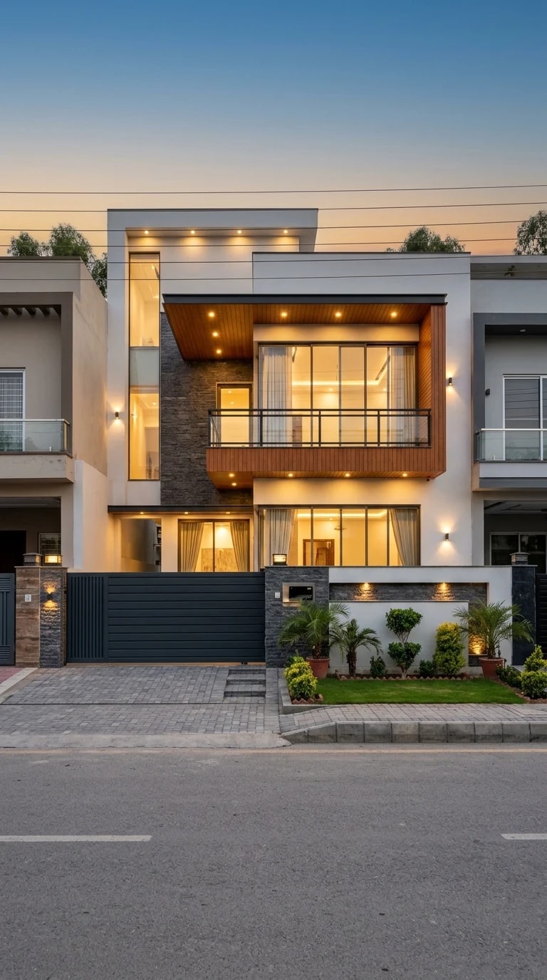
The house in the photograph doesn't shout. It glows. At dusk, its stacked white and cream volumes, wood-slat accents, and glass balcony read as a single composed image: symmetrical, warm, and quietly confident. That effect isn't accidental. It's the same kind of deliberate decision-making that goes into a well-designed website, where hierarchy, contrast, and breathing room guide you without you noticing. If you're dreaming up a home facade, stealing a few pages from the web designer's playbook can make the result feel effortless.
The first principle is visual hierarchy. On this facade, your eye lands on the lit glass balcony and the large windows below it—the hero section of the composition. The stacked volumes create a grid that keeps everything aligned, while the dark gate and paved drive act like navigation, pointing you toward the entry. In web design, you'd call this a clear call to action. At home, it means deciding what you want people to notice first, then supporting it with repetition and alignment. A jumble of materials and window sizes is like a page with five competing buttons; nobody knows where to click.
Contrast is the second lesson. The cool blue twilight against warm interior and exterior lighting creates depth and rhythm, much like a well-chosen accent color against a neutral background. Cream stucco plays against charcoal railings, wood slats against stone. The lighting itself is layered—recessed soffit lights, wall sconces, and the glow from inside—so the house never looks flat. Think of the lit entry as a hover state: it signals welcome and safety. A facade without contrast feels like a website with no visual cues; you can't tell what's important.
Finally, whitespace and responsive thinking. The small landscaped garden and the paved drive give the house room to breathe, just as margins and padding keep a layout from feeling cramped. The symmetry reads as order, which is comforting at street level. But a good website also works on any screen, and a good facade works in different conditions: from the curb, as you walk up the path, and at various times of day. The gate and the lit path are affordances—they tell you where to go. Before you commit to a design, test it at dusk, from across the street, and in motion. The best dream homes, like the best interfaces, feel intuitive before they feel impressive.