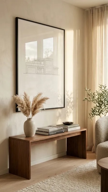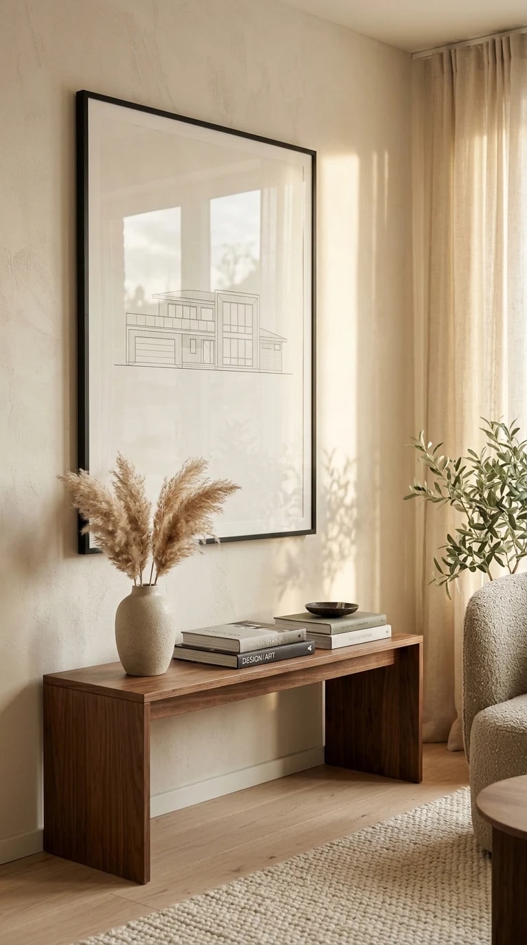
There is a particular kind of calm that only happens in a room where nothing is shouting. This vignette is built on a console table no deeper than a few handspans, pushed against a wall the color of milky coffee. The proportions matter more than the pieces: a long, low surface paired with generous empty wall above it. That ratio, roughly four parts width to eight parts breathing room, is the quiet math behind most rooms that photograph well and live even better. Skip it and the same objects turn cluttered; respect it and a single vase reads like a sculpture.
The styling itself follows a simple rhythm. A tall ceramic vase of pampas grass anchors the left, its feathery volume softening the hard line of the frame above. A stack of design books gives the eye somewhere to land, and a small dark bowl adds the one note of weight the arrangement needs. Above, a black-framed architectural line drawing repeats the geometry of the wall without competing with it. Three heights, three textures, one palette of cream, oak, and charcoal. Nothing matches, everything agrees.
But the real material here is light. Sheer curtains on the right diffuse a low morning sun into something almost liquid, and the olive tree in the corner throws long, crooked shadows across the plaster and the artwork. Those shadows shift hour by hour, which means the room is never quite the same twice. If you want this effect, watch your windows before you buy anything. Notice where the light lands at eight in the morning and where it pools at four. Then place the furniture so the shadows fall on a blank, textured surface rather than on busy pattern. A wall with a little grain, limewash or Roman clay, rewards that light far more than flat paint.
Scale is where narrow consoles usually go wrong. A four-foot table under a four-foot artwork will feel cramped, so let the art run slightly wider than the surface, or go deliberately smaller and off-center. Keep the depth shallow enough to walk past without turning sideways, and choose legs over a solid base so the floor keeps flowing underneath. In a hallway or behind a sofa, that visible gap is what keeps a slim piece from reading as a blockade.
Finally, resist the urge to fill the surface. One organic element, one stack of something you actually read, one small dark object to ground it. Leave the rest to the sunlight and the olive tree. A 4x8 vignette is not about decorating a wall. It is about setting a stage and then getting out of the way.