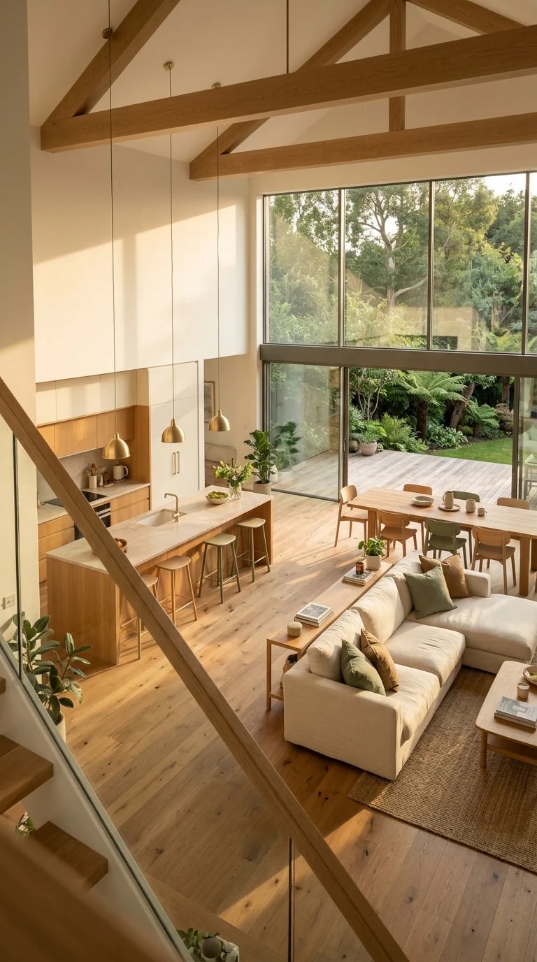
Standing at the top of the stairs, the whole room opens up at once: a vaulted ceiling crossed by exposed timber beams, a long island with pendant lights, a dining table, and a cream sectional that seems to float on pale floors. Floor-to-ceiling glass along the far wall pulls the garden inside, and late afternoon sun turns every surface a shade warmer. The colors doing all this work are surprisingly few. Warm oak, cream and off-white, sage and olive green, with a thin thread of black for definition. Nothing shouts, and that is exactly why the space feels so restful.
The logic behind the palette is a simple ratio. Roughly sixty percent of what you see is a pale neutral, meaning the walls, the floor planks, the sofa, and the rug. About thirty percent is wood, spread across the island, the beams, the dining table, and the window frames. The last ten percent carries the color and contrast: sage-green upholstery or cabinetry, olive leaves on the plants, and black accents on pendant shades, hardware, and door frames. Pale neutrals give the eye somewhere to rest, wood supplies the warmth, and green ties the interior to what grows outside the glass.
Wood is the trickiest part to get right, because too many undertones will fight each other. In this room the oak reads consistently warm but never orange, and the floor is kept light so it reflects rather than absorbs the daylight. If your own beams are darker than your flooring, repeat that darker tone once or twice at eye level, perhaps in bar stools or the dining chairs, and the mismatch starts to look intentional. Keeping the finishes matte helps as well; a satin sheen on a large island can bounce light harshly under a vaulted ceiling.
Green works best here as a connector rather than a statement. A sage sofa sits comfortably beside olive foliage without competing for attention, and if you want to push further, painting the island base or a run of lower cabinets in a muted sage gives the room a soft anchor without darkening it. Black should stay small and deliberate: slim pendant cords, cabinet pulls, a single window frame. Textiles carry the rest, so layer linen, wool, and a textured rug in tones that sit within a shade or two of the walls.
Before committing, paint large sample boards and move them around the room at different hours. Warm palettes like this one shift dramatically between cool morning light and golden evening sun, and a green that looks grey at noon may look lush by six. Repeat the same three or four colors in every zone so the kitchen, dining, and living areas read as one space, and let the garden outside count as part of the scheme. When the palette inside echoes the view through the doors, the room feels twice as large.