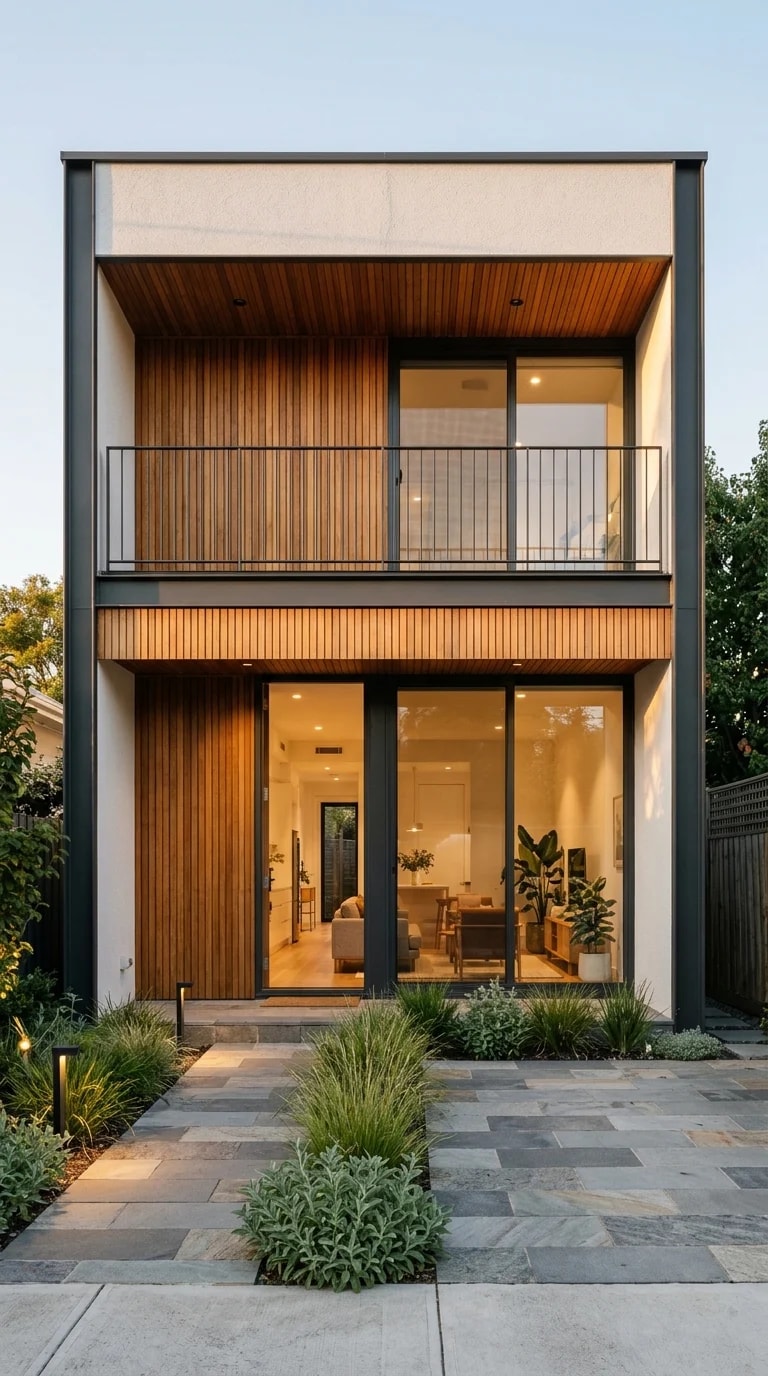
Narrow plots are the reality of most Indian cities, and the best home design plans indian architects draw up today treat that constraint as a design brief rather than an apology. This facade shows the approach clearly: a compact two-storey frontage, framed by dark structural borders and cream stucco side walls, that reads as generous rather than squeezed. The trick is verticality. Honey-toned wood slats run the full height of the central bay, pulling the eye upward and making the house feel taller than its floor count suggests. Symmetry does the rest, with the entry path dead center and the balcony railing squared off above it.
The material palette is deliberately short. Charcoal frames, warm timber, pale stucco and gray stone pavers give the elevation a rhythm without clutter, which matters when the frontage is only a few meters wide. Tall glass doors and windows fill the middle band, and at dusk the interior light does the decorating: a living area with seating and plants glows amber behind the glazing, turning the house into a lantern. For anyone working through home design plans indian plots demand, this is the lesson worth stealing — spend on glass and lighting where people will see them, and keep the surrounding surfaces quiet.
The transition from street to door is handled with equal care. Stone pavers step through low grasses and clipped shrubs, and small black bollard lights mark the way without glare. No high wall, no heavy gate blocking the view; the planting does the screening. On a tight urban site this soft edge buys privacy while keeping the entrance legible, and it costs far less than a boundary of imported stone. It also solves a practical problem in Indian weather — porous paving and drought-tolerant planting handle monsoon runoff better than a fully paved front yard.
Inside, the glimpse of seating and greenery hints at a plan organized around the front room rather than a deep corridor. That is a sensible move on a narrow lot: put the most-used living space at the front, let it borrow light from the tall glazing, and push service areas to the rear where ventilation can be managed with shafts and courtyards. The balcony above extends the same logic outdoors, giving the upper floor a shaded perch that also breaks up the mass of the elevation.
What makes the composition work is restraint. Three materials, one strong vertical gesture, one warm light source, and a path that tells you exactly where to go. If you are briefing an architect for a similar plot, bring a photograph like this and talk about proportion, glazing height and entry sequence before you talk about finishes. Get those right and the house will look composed at twilight, in daylight, and from the street ten years from now.