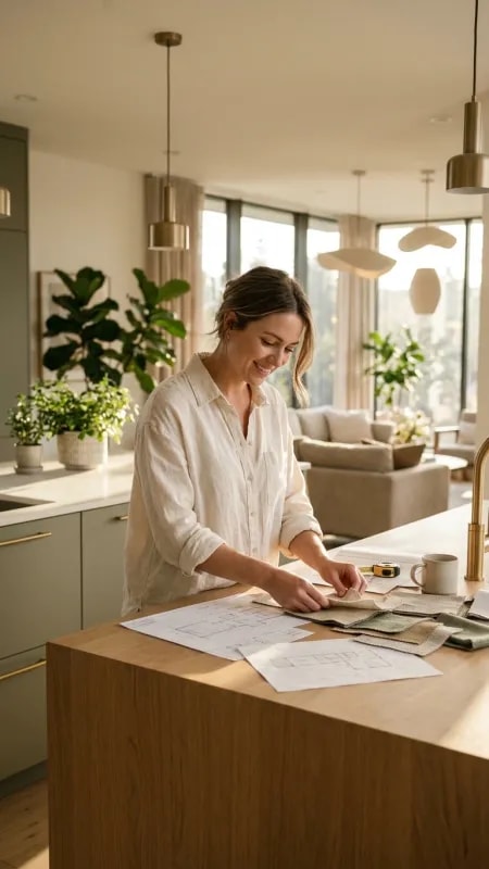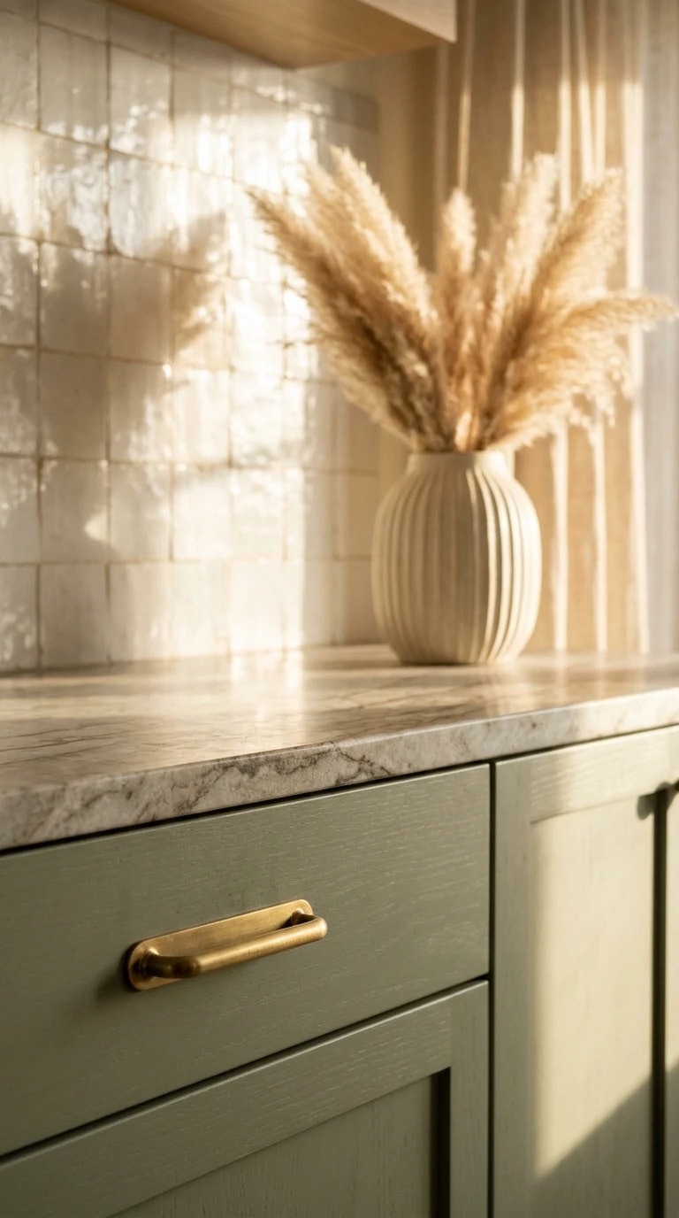
The most memorable rooms are rarely the largest ones. This corner of a kitchen works because every element was chosen for how it feels in the hand and how it catches the light, not for how it photographs from the doorway. The starting point is the cabinetry: a pale sage green with just enough gray in it to stay quiet all day, painted in a matte finish so the surface absorbs light instead of throwing it back. Then come the pulls — narrow, rounded gold bars, no ornament, set vertically so they read as thin lines rather than hardware. In Korean home design, this restraint is the whole point. A single material decision is allowed to be the luxury, and everything else steps back to let it breathe.
Behind the counter, the backsplash is a grid of small square tiles in a high gloss, a classic choice that turns practical wipe-down surface into a subtle reflector. On a sunny morning the tiles bounce warmth across the room, and the sheer curtain hanging to the side filters the incoming light into something softer and more diffuse. That curtain matters more than it looks. Korean interiors lean hard on daylight as a material, and the goal is almost always a gentle glow rather than a hard beam. Where the sun does land, it draws crisp shadows across grout lines and cabinet edges, giving a still life a bit of theater.
The marble countertop is where the styling happens, and the arrangement is deliberately sparse: one ribbed, off-white ceramic vase holding a few stems of pampas grass, nothing else competing for attention. The ribbing of the vase echoes the grid of the tiles, a small rhyme of texture that makes the composition feel intentional. Pampas grass has become a staple of this aesthetic because it is soft, pale, and slightly oversized — it fills vertical space without adding visual noise or requiring weekly replacement. If you are recreating the look, choose a vessel with a matte or satin glaze and keep the stems tall enough to break the line of the window.
The broader lesson is about layering rather than decorating. Cream, sage, and a thin trace of gold are only three colors, but the room feels rich because the materials differ so much: cool stone, warm ceramic, dry grass, painted wood, glass tile. Korean home design tends to build a palette this way, repeating a few hues across many textures and letting contrast come from finish instead of from color. It is a forgiving approach for renters and renovators alike — paint the cabinets, change the hardware, add one good vase, and hang something sheer at the window. The result is a corner that invites a slow cup of coffee rather than a scroll through a catalog.
Start with the light, then the hardware, then the vase. The rest will follow.