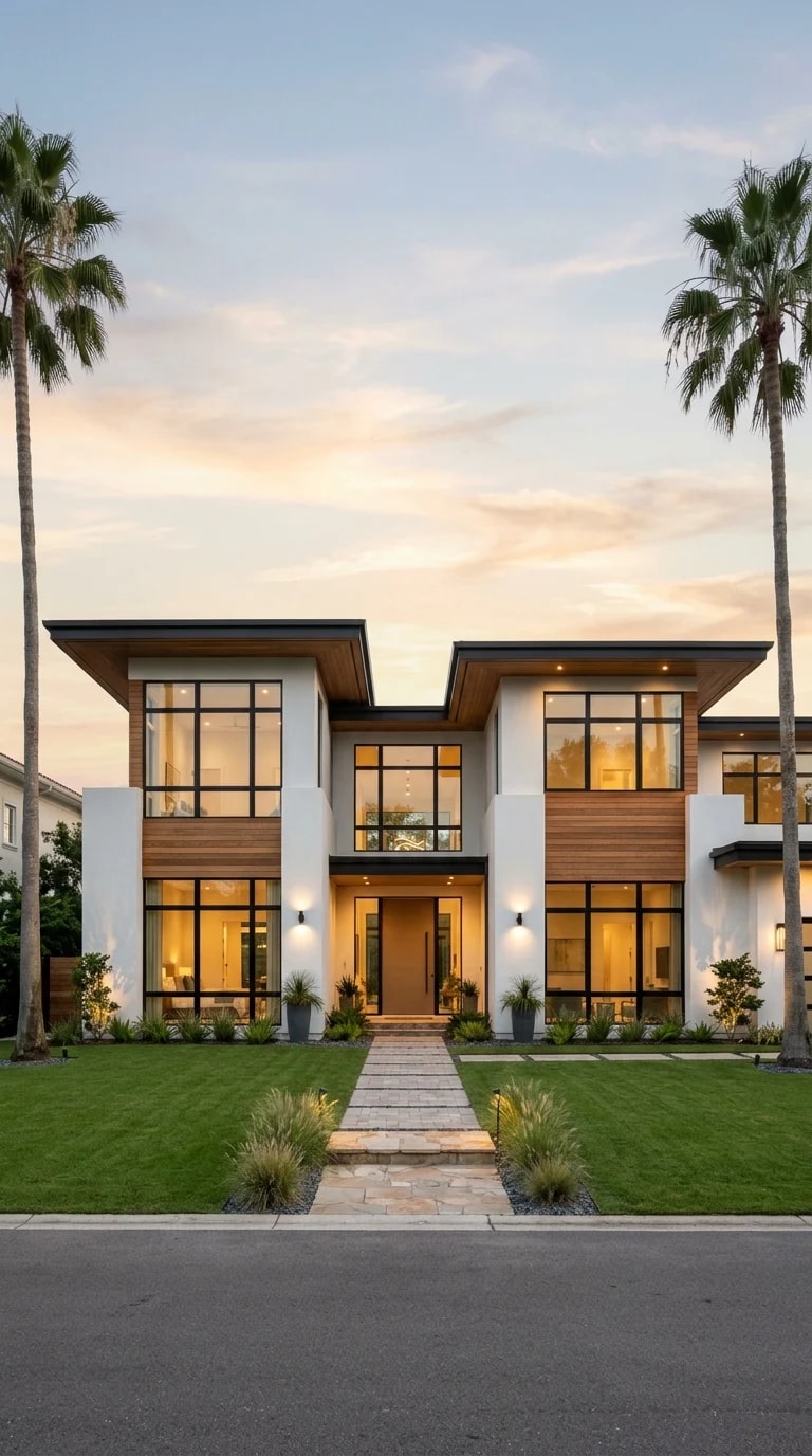
At dusk the house holds the street like a stage set: white stucco volumes stacked squarely under deep flat roof overhangs, honey-toned wood paneling warming the ground floor, and two tall palms standing sentry at either edge of the lot. Everything is centered. The stone-slab walkway runs straight to a glass entry door, and the lawn and low grasses part politely around it. Nothing about the composition feels cramped, which is the quiet magic of the thing — this is a 900 sq ft home design pretending, quite convincingly, to be something grander.
The first trick is symmetry. A centered door with matching window bays on each side gives the eye a balanced frame to rest in, and balance reads as calm, and calm reads as spacious. The second trick is verticality. The windows are tall and narrow, black-framed and mostly undivided, so they pull the gaze upward rather than sideways. Deep overhangs do double duty: they shade the glass in summer and cast a dark horizontal band that makes the white volumes beneath them look taller. Splitting the facade into two materials — pale plaster above, wood below — adds height without adding a single square foot.
Then there is the lighting, which is doing more work than any square footage could. Warm interior glow spills through the glass, wall sconces mark the entry, and the sconces' amber sits against a sky sliding from peach to lavender to pale blue. A small house lit this way looks inhabited and generous rather than merely small. The planting follows the same logic: low grasses and potted specimens instead of heavy hedges, so the facade is never crowded and the lot feels wider than its measurements.
Inside, that 900 sq ft plan likely leans on the same axis the walkway establishes. One strong sightline from the front door through the main floor, a stair pushed against a solid wall instead of floating in the middle of the room, and windows sized to bring in volume rather than just views. Rooms stay few and whole; every partition eats the impression of space. Tall glass on two exposures lets daylight bounce deep into the plan, so the middle of the house never goes dim.
What makes the image worth studying is restraint. One material palette, one symmetrical gesture, one repeated window proportion, and a lighting scheme that flatters all three. Copy that discipline into a compact plan and the results are the same at dusk: a house that feels unhurried, polished, and considerably bigger than the number on the deed.